New Default Mobile Template
After strong customer feedback we have upgraded the default mobile templates to include banners. If your banner is a large file, it might slow down load the time of your first webpage on a remote 2G or slow connection.
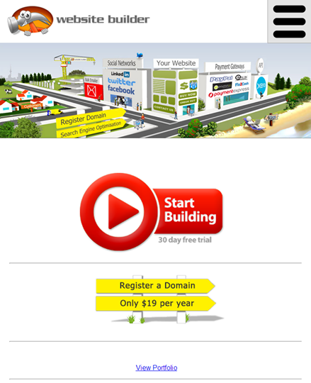
The new default mobile template now looks something like this.
This default layout has your stanadard logo and company name top left, menu button top right, and banner stretched across screen.
The footer includes a search box, but the old footer menu has been replaced with the popup menu button, that is always visible even on long pages.
The home page of a mobile site can be customised to have different content from your normal home page, that are optimised for fingers, and short on words.
You can select other default layouts within the CMS, and play with colors using your "Primary Colour", depending on the template. If you require further customisation, please just contact one of our freelance designers or resellers.
A responsive layout is also achieved by advanced designers using CSS to tweak the design as the resolution decreases...
If you prefer to have the same layout on mobile, you can easily disable our default mobile mode, however, usability on small devices is most important.
Or you can disable the mobile template mode completely. We do recommend that the mobile templates are used, as they are the most efficient for big fingers on little screens, without needing to constantly pinch and zoom the little screen.
We have designed our mobile templates to be super fast and lightweight and great for customers who are not on 4G connections to get quick page load times. In comparison, a responsive wordpress mobile template with jquery and other unneccessary plugins might take 10 seconds or more to load the home page on a rural mobile connection.
Posted: Tuesday 10 June 2014


