When it comes to understanding website usability, a good place to start is an all encompassing definition: it's about how easy or hard people find to use your website. Website usability matters because if a site is too complex, too hard to understand and challenging to navigate, people will go elsewhere. This results in a high bounce rate, low conversions and maybe even a drop in your traffic and SEO rankings. The good news is though, fixing a site's usability is generally pretty simple. Today we're going to explain more about what website usability is, plus how you can improve your own site's usability too.
What is Website Usability?
Steve Krug, a professional usability consultant says that usability means "A person of average ability and experience can figure out how to use the thing to accomplish something without it being more trouble than it's worth." This means that the doing of something requires people to stop and think, it's too hard and needs to be corrected.
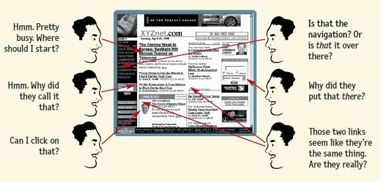
The visitor to a page on your site needs to be able to 'get it' instantly, be able to know what it is and how to use it without needing to think about it. Take a look at this image from Steve's book, Don't Make Me Think (and also on his website).This image shows how a busy or cluttered page confuses the visitor, making them ask themselves questions to understand what they should do next. It's this, that each page on your site needs to avoid doing.
Things on a web page which affect it's usability include:
- headings
- amount of text
- images
- buttons and calls to action
- menu and how it is organised
- colours
- position of things on the page
- mobile responsive
- white space
So, now let's take a look at what you can do about your site's usability!
How To Make Your Website Easy to Use
If you haven't yet got a website, you have an advantage over those who have. That's because it is easier to work on a site's usability when starting from a clean slate than one which already exists. However, it's not that much harder and certainly not impossible to do. These tips below though, can apply to both new and existing sites.
- Use visual hierarchies - this means making the more important stuff bigger and nearer to the top of the page. You can make your headings larger in two ways: you could make the font size larger or you could give you heading a heading tag, which will also make the font larger depending on your site's settings. Heading tags also have the advantage of being useful for your SEO, with Heading 2 (more important) and Heading 3 (less important) being the ones you should use within a page. A visual hierarchy also includes having things placed on the page in a logical order. This means grouping like things together or putting them in a clearly defined area.
- Use the known - there are things in this world which are universally known and understood by everyone. The shape of a stop sign is a good example of this. When it comes to websites, there are already a few things universally known too. For instance, that a menu is at the top or the left hand side of the page, shopping carts look the same regardless of the website, a contact page gives an email address or form to complete and social media buttons always look the same. Reinventing the wheel on your site just to make it different from everyone else's can seriously backfire, because it can lead to people needing to think!
- Use defined areas - organise and divide your content into areas which contain the same sort of thing. For instance, group category lists together.
- Be obvious with clickable things - people shouldn't have to think if they can click on an image or button, but just instantly know. This means use things like buttons, underlined text, text in different colours or words, such as click here!
- Keep it clutter free - a busy web page is the same as being shouted at by multiple people. You don't know where to look, what to do and really want to get away! Using the theory less is more, structure your web page with only the essentials and plenty of white space.
- Make it easy to scan - a web visitor doesn't read everything on your page. They look for what they want and ignore the rest. This means they will scan a page using clues like headings, images and buttons to find what they want.
- Structure your text well - using headings (h2 and h3 for inside a page, h1 for the page heading title), short paragraphs, lots of white space, bullet points and highlighted text.
For more helpful advice on the designing of your website, take a read of our articles 5 Important Pages You'll Need to Add to Your Website and a Guide to Using Images on Your Website.
Posted: Thursday 4 October 2018