Setting a maximum width
By default the width of the snippet blocks attempt to stretch to the full width of the content area, but you can set a max-width to restrict how wide it goes.
You can set a max-width within the Style Modals spacing tab.
Why max-width and not width?
With content needing to work on mobile, setting a fixed width property could cause issues.
How to set a max-width
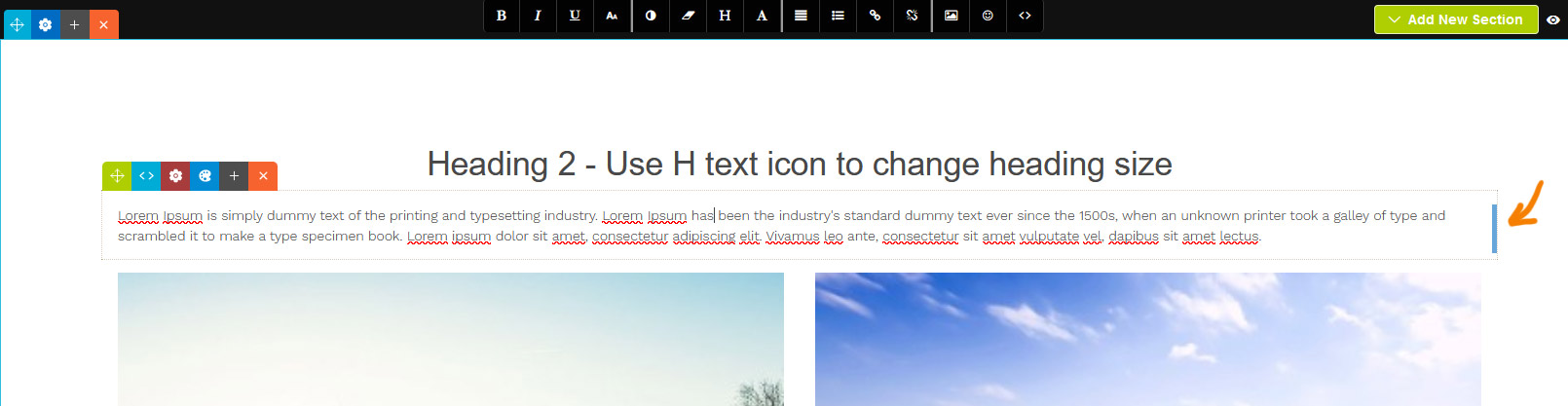
You can drag-resize the content by clicking and dragging the handle that appears in the right of the snippet block when selected.
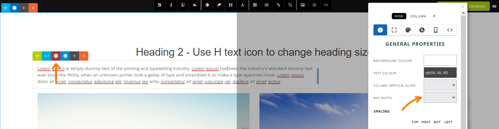
You can set also a specific max-width by clicking the RED COG ICON which will launch the style modal. From there select a value from the MAX WIDTH dropdown on the properties tab.
Aligning the snippet block
Aligning via dragging the snippet block
Using the Green Drag Icon at the top-left you can choose to align the snippet left, right or center by dragging it horizontally.
Aligning via the Style Editor popup

By default the snippet will be left-aligned, but you can center the snippet via the STYLE EDITOR as needed.

When a snippet block has a custom max-width set, an alignment option will be available on the properties tab.

The snippet block is now set to align center.
More From This Section
FAQ Topics
Building your site
Advanced Page Types
E-Commerce
- Shopping Basics
- Product Pricing, Currencies
- Category Management
- Products
- Product Options
- Layout and Formatting
- Payment Options
- Freight - Couriers
- Processing Orders
- Orders / Invoices
- Advanced Ecommerce
- Plugins
- Wholesale
- Bookings Management System
- Stock & Quantities
- Vouchers, Discounts, Loyalty Points
- Selling Photos / Prints
- Shopping Cart Add-on Page types
- Advanced APIs / Add ons
- Point of Sale (POS)
- Reports
Email & Membership
Promoting your site
Advanced
- Power User Options
- Form Spam Filtering
- Wordpress
- PHP Setup
- [TAGS]
- jQuery snippets
- Search External Links / Import external content
- HTML / CSS Snippets
- Embedding Web Fonts
- Loading additional Material Symbols styles
- FAQ Help Map
- Uploading local font files
- Advanced Template Customisation, CSS, etc
- Languages and Translations
- Importing Content from Another Platform