7 Popular Website Colour Schemes to Inspire You
There's no doubt about it: colours can affect us in many ways. The colours you choose for your site can impact upon the level of sales you make, how long a visitor stays on your site and how they feel when visiting your site.You can find out more about this by reading our article, Learn How to Increase Website Conversions Using Colour Psychology.
Now let's explore some of the colour options for your website:
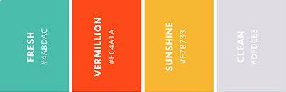
Bright & Fun
These four colours combine to provide a welcoming palette with a clean and crisp appearance.
Use Tints
Using different tints and tones can help you emphasize different parts of your site, while giving it a minimalist appearance.
Modern
For a modern appearance, try using these four colours.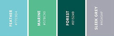
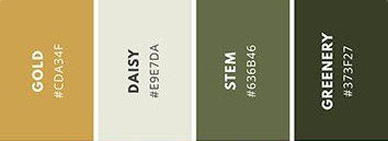
Sleek and Fresh
Perfect for an eco-themed or environmental website, to provide a fresh, clean and calming effect for visitors.
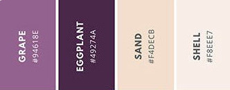
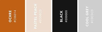
Vintage Themed
Many ecommerce stores are selling vintage themed products nowadays. Use these modern vintage colours for the wow factor.
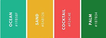
Tropical Themed
Selling modern products, or offering a holiday or high energy service? Then try these!
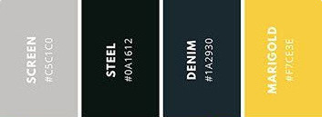
Minimalist
Keep things minimal by using the darker colours along with white, then adding splashes of the lighter colours for attention.
Deciding Where to Put Your Website Colours
Once you've decided on the colours for your website, you need to choose where to put them. Here are some of the areas you will need to consider
- Headings
- Title
- Border
- Paragraph text
- Background
- Menu
- Links
How to Change Your Website's Colours
To learn more about changing your website colours, view our video below. For further inspiration, check out this Pinterest board which has plenty of awesome website colour schemes!
Posted: Friday 1 February 2019