The Header Snippet if added to your template allows you to customise the behaviour of your templates masthead section.
If available you can launch the settings popup via the HEADER SETTINGS button.
Where to edit the Header
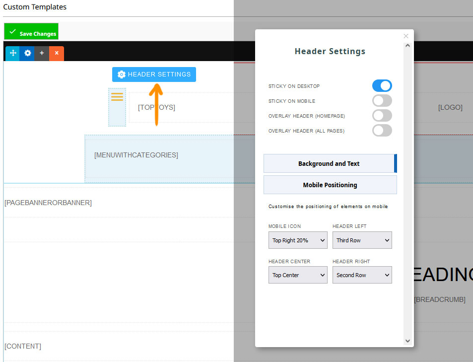
Clicking the Header Settings button will launch the settings popup for the snippet block.
Options available
Sticky On Desktop: Set masthead section to stay above the content as you scroll down the page - only on desktop
Sticky On Mobile: Set masthead section to stay above the content as you scroll down the page - only on mobile
Overlay Header (Homepage): Position the masthead section over the content - on on the homepage
Overlay Header (All Pages): Position the masthead section over the content - on all pages
Background and Text options
Light Text: Set masthead section to use light text
Dark Text: Set masthead section to use dark text
Background Fade In (Homepage): Set the background colour of the masthead, as set in Colours > Banner Colour area, to fade in as the page is scrolled (Homepage Only)
Background Fade In (All Pages): Set the background colour of the masthead, as set in Colours > Banner Colour area, to fade in as the page is scrolled on all pages.
Section Background Colour: Set the background colour of the
masthead. Note this will override the Fade In option if set. Use the Colours > Banner Colour to have a custom colour work with fade in.
Formatting for Mobile
Mobile Positioning
Choose the positioning of the column elements within the header snippet.
Top Settings (e.g. Top Left, Top Right 20%): Set the positioning on the top row on mobile.
Second Row, Third Row, Fourth Row: centers the column content on a row below the top row.
Hide on Mobile: Do not show the element on mobile.

Above example of Mobile Positioning elements, Top Row and additional row options.
Mobile Positioning - Nested / Inner Column Elements
If your header element contains multiple template tags in a column e.g. [SOCIALICONS] and [TOPTOYS] you can still set the positioning of the column element as above, but also have the ability to set vertical ordering for the inner elements e.g. Right Inner-top.
Order 1, Order 2, Order 3: centers the nested / inner content vertical order.
Hide on Mobile: Do not show the element on mobile.
See the Header Snippet settings in action
FAQ Topics
Building your site
Advanced Page Types
E-Commerce
- Shopping Basics
- Product Pricing, Currencies
- Category Management
- Products
- Product Options
- Layout and Formatting
- Payment Options
- Freight - Couriers
- Processing Orders
- Orders / Invoices
- Advanced Ecommerce
- Plugins
- Wholesale
- Bookings Management System
- Stock & Quantities
- Vouchers, Discounts, Loyalty Points
- Selling Photos / Prints
- Shopping Cart Add-on Page types
- Advanced APIs / Add ons
- Point of Sale (POS)
- Reports
Email & Membership
Promoting your site
Advanced
- Power User Options
- Form Spam Filtering
- Wordpress
- PHP Setup
- [TAGS]
- jQuery snippets
- Search External Links / Import external content
- HTML / CSS Snippets
- Embedding Web Fonts
- Loading additional Material Symbols styles
- FAQ Help Map
- Uploading local font files
- Advanced Template Customisation, CSS, etc
- Languages and Translations
- Importing Content from Another Platform