With the Drag-drop and Contentbox editors, you can set mobile-only formatting options via the dedicated Mobile Styling popup window or via the Style Editor popup.
There are also Contentbox section and Image specific options available.
How to launch the Mobile Styling popup (changing the editor to mobile size)
Changing the Editor Size dropdown to MOBILE will reduce the viewport to a mobile width and launch the Mobile Styling popup window.
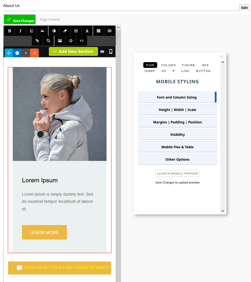
You can then click into different areas of content (or navigate to different areas of content via the navigation at the top of the popup) and apply various settings.
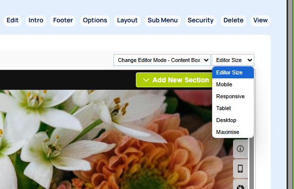
You can launch by clicking the EDITOR SIZE dropdown and selecting the Mobile option.
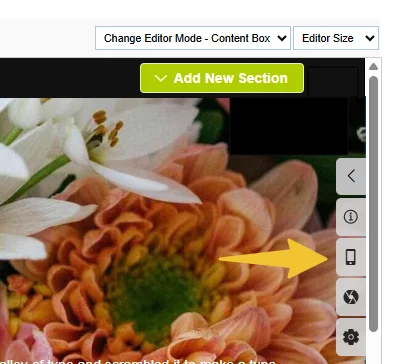
In the Contentbox editor you can also click the mobile icon found to the right of the editor.
Launching the Mobile Styling popup via keyboard shortcut CTRL + ALT + M
You can launch the Mobile Style popup without changing to Mobile mode via CTRL + ALT + M. You will need to ensure you have clicked into the page to focus the browser / enable keyboard shortcuts.
This will launch a persistent popup window that will stay visible as you navigate around pages. When you close the window via the X icon top right (or by the same keyboard shortcut) it will no longer appear when changing pages.
The editor will not change to the mobile view automatically with this approach
Launching a Mobile preview popup window
To view a full Mobile preview with the template included, click the LAUNCH MOBILE PREVIEW button at the base of the popup. This will load the site in a new moveable popup.
Saving changes to the page after applying mobile settings will refresh the preview window.

To apply mobile-only styling via the Style Editor popup
- Click into the snippet block on your page you would like to change the visibility for,
- Then click the RED COG ICON (shown below) that appears on the row tools icons top left of the snippet. This will launch the Style Settings Popup / Style Editor.
- Select / Navigate to the element you want to apply mobile styling to, then click the MOBILE ICON in the set of tabs.

Select / Navigate to the element you want to apply mobile styling to.
In the popup that appears, select the element you would like to change visibility for. By default this is the entire block (ROW), but you can also choose columns or elements within it such as paragraphs and images.
If there are multiple elements of the type you select, e.g. Columns, Images or Text, you can navigate between them using arrow buttons that appear at the top of the modal.
Open a mobile setting section to apply the relevant mobile options
Within the mobile settings you will find sections for Font Size, Text Alignment etc, click to open a section to see the options.

The change will be automatically applied to the element, which will then have a highlight colour and caption to indicate its status e.g. MOBILE ONLY.
Remember to save your changes.
To apply mobile-only styling to a Contentbox Section
- Click into the section on your contentbox page you would like to change the mobile settings for,
- Then click the BLUE COG ICON (shown below) that appears on the contentbox tools icons top left of the snippet. This will launch the Contentbox Inspector.
- Open the mobile settings area and change the required setting.

Applying mobile-only styling to an image
- Hover over the image and click the ORANGE CROP ICON
- Ensure your image is set to any option other than AS IS
- From the popup that appears, set your mobile image height

FAQ Topics
Building your site
Advanced Page Types
E-Commerce
- Shopping Basics
- Product Pricing, Currencies
- Category Management
- Products
- Product Options
- Layout and Formatting
- Payment Options
- Freight - Couriers
- Processing Orders
- Orders / Invoices
- Advanced Ecommerce
- Plugins
- Wholesale
- Bookings Management System
- Stock & Quantities
- Vouchers, Discounts, Loyalty Points
- Selling Photos / Prints
- Shopping Cart Add-on Page types
- Advanced APIs / Add ons
- Point of Sale (POS)
- Reports
Email & Membership
Promoting your site
Advanced
- Power User Options
- Form Spam Filtering
- Wordpress
- PHP Setup
- [TAGS]
- jQuery snippets
- Search External Links / Import external content
- HTML / CSS Snippets
- Embedding Web Fonts
- Loading additional Material Symbols styles
- FAQ Help Map
- Uploading local font files
- Advanced Template Customisation, CSS, etc
- Languages and Translations
- Importing Content from Another Platform