
Hi [FIRSTNAME]
This edition of website.world news is dedicated to Mobile Responsive Websites.
- All about Mobile Responsive Websites.
- Our Most Popular Theme: Minimal
- How to upgrade to a mobile responsive template
- New dedicated mobile template layouts
- Tips on Mobile Responsive Content
- Tweaking your CSS to be Mobile Responsive.
- August Promotion: Win $4500 Busines Makeover Package
- Awesome Updates and New Features
- Professional mobile website upgrade - only $100
- 100% Up Time
- Need training?
- Clearing your browser cache
- Better Broadband & 0800 telephone numbers
- 25% discount on hosting
- Start your own business - reseller options
- Cool links/system links
- Websites of the month
All about Mobile Responsive and Dedicated Mobile Websites
There are a few different ways to make your website more awesome for mobile users
- Dedicated Mobile Website Template
- Responsive Mobile Website Template
- Completely Separate Mobile Websites
Dedicated Mobile Website Templates
A dedicated mobile website template is the traditional way we have provided backward compatibility for all our desktop website templates to offer your customers a better mobile experience. The mobile template uses the same navigational sitemap, and same content as your desktop website. However, we trimmed off all the unnecessary clutter to ensure your customers could quickly get to the information they want. For example, navigate to your contact details, view a map link, or view your products and make a purchase easily on their small screens. Over time we have added banners, logos and auto matched the colours to your desktop template. With fine tuning to your dedicated mobile template design, your customers will have an awesome experience, as this method is thefastest option for customers using slow rural mobile connections. Dedicated mobile templates are usually 3 times faster to load than a responsive template, and 10 times faster than the average WordPress template.
Responsive Mobile Website Templates
Responsive templates are a popular approach in the web design industry, because not every CMS can provide a dedicated mobile template option. Responsive design means that the template has been specially crafted to change shape in different browser widths. Responsive templates can be difficult for users to edit themselves, as each element needs to be especially crafted. For example, menus might be condensed, or relocated off page, and pulled in when needed. Responsive websites tend to be slower to download on mobile devices, as the mobile device needs to download all the styles/themes that are used in the desktop version, even if not used in the mobile version. Some web designers focus on making great looking templates, but they forget about these download speed issues. If your website is tourist oriented, your customers may be out and about on the edges of mobile phone coverage, and they might have trouble downloading all the additional JavaScript and CSS libraries that are not required for the mobile experience. Responsive templates are often slow to download, but we have been working hard to make our new responsive templates as fast as they can be, and our responsive templates will render about 3 times faster than the average WordPress theme. Our responsive websites can be customised with different colours, fonts, and images.
Completely Separate Mobile Websites
Having a whole website crafted just for mobile might give a really good mobile experience at first, but more often than not, the webmaster forgets to maintain it (or cannot maintain it) , and the information become out of sync in each website. If you are running an online shopping site, you really need to have both your mobile experience and your desktop experience powered by the same shopping cart engine. We advise our customers not to use this approach.
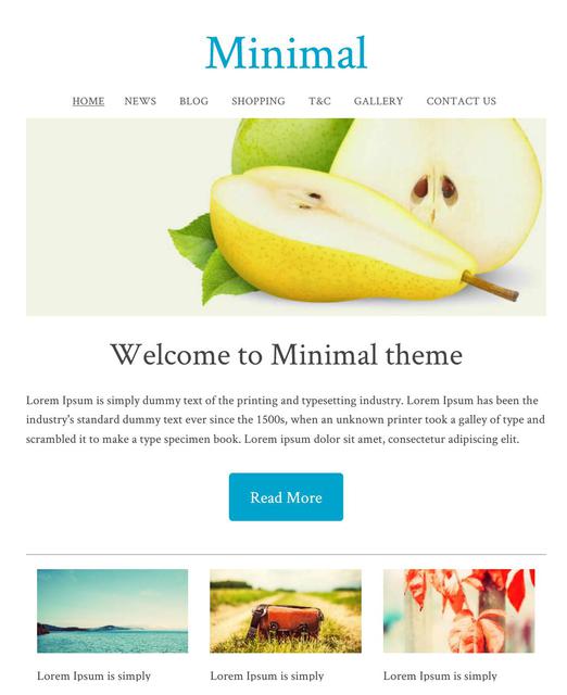
Our Most Popular Theme
The minimal template range is currently the most popular theme selected by our users. With a simple white background, and a big beautiful images, you can create a great looking website, and choose your own fonts and colours for the text, headings, and buttons.
The Minimal Template ID: 114657 has the pretty much the same look in both dedicated mobile mode, or responsive mode.
All New Responsive Templates
We have upgraded lots of our old templates to be all new responsive templates, wide on big screens, just right on small screens, and fast and beautiful on the smallest of mobile screens. These are available under the dedicated "Responsive" tab.
Our responsive templates can be customised by you:
- Animated Banners
- Logo or Business Name
- Background Image, Colour or Texture
- All colours selectable
- Custom fonts, sizes, and linespacing
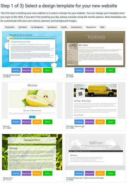
How to Convert Your Existing Website to A Responsive Template
We have lots of different responsive templates that you can choose from. We are updating more all the time. When you change to a responsive template, it will update both your desktop and mobile layouts.
- In the CMS, go to the DESIGN tab
- Select CHANGE THEME
- Look through all the themes, and take note of the RESPONSIVE or MOBILE button. This button allows you to preview the theme in either mode. Only the themes with RESPONSIVE button are responsive templates.
- SELECT a theme to continue.
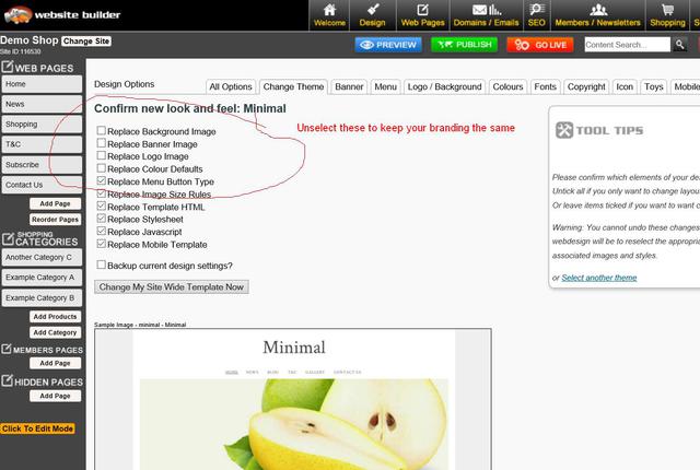
- Untick the boxes for changing banner, logo, background and colours, if you want to keep your existing brand elements the same.
- Tick the box to backup your old design settings, just in case something goes wrong.
- Save the theme change.
- Sometimes when you preview your website after a theme change, it might not look right, due to browser caching settings. You may need to PUBLISH and clear your browser cache, to see your website looking right.
- Sometimes you may need to reapply your colour settings for menus etc, as some templates provide the default colours, and others don't, or perhaps your colour combinations are not immediately compatible with the template, and may need some fine adjusting.
Dedicated Mobile Option - New Templates
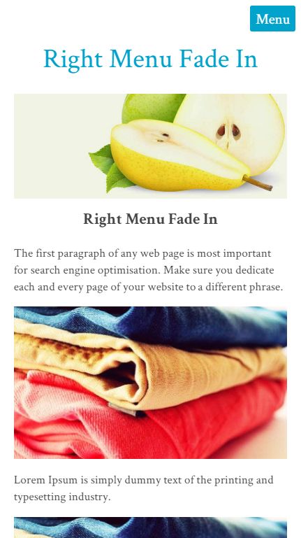
The minimal template is one of our most popular, and it has a responsive look that many like. We have also added the same look to our dedicated mobile themes. It has a menu that fades in from the right when you press the MENU button.
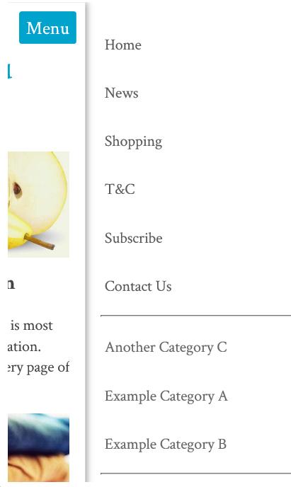
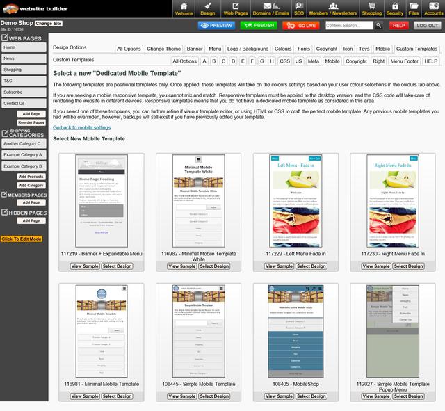
How to Select A New Dedicated Mobile Template
We have 8 different dedicated mobile templates, but each will use the colours and font from your desktop theme.
- In the CMS, go to the DESIGN tab
- Select MOBILE TEMPLATES
- click SELECT A NEW MOBILE THEME
- Look through all the themes, and take note of the RESPONSIVE or MOBILE button. This button allows you to preview the theme in either mode. Only the themes with RESPONSIVE button are responsive templates.
- SELECT a theme to continue.
- Untick the boxes for changing banner, logo, background and colours, if you want to keep your existing brand elements the same.
- Tick the box to backup your old design settings, just in case something goes wrong.
- Save the theme change.
- Sometimes when you preview your website after a theme change, it might not look right, due to browser caching settings. You may need to PUBLISH and clear your browser cache, to see your website looking right.
- Sometimes you may need to reapply your colour settings for menus etc, as some templates provide the default colours, and others don't, or perhaps your colour combinations are not immediately compatible with the template, and may need some fine adjusting.
Tips On Mobile Responsive Content
If you want the best user experience for mobile devices, your content needs to be mobile responsive too. Many of our customers have used our old TinyMCE editor mode to create complex table structures, with lots of rows and columns to layout images and text just so. This sort of layout will not automatically adjust to a small width screen, and some of that content maybe clipped or require a scroll bar to access.
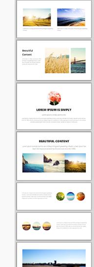
The best content editor for beautiful responsive content, is our new Drag and Drop editor. See the snippets on the right. Drag these snipped into your content area, and then edit the text, images and links.
These display widgets already know how to auto adjust themselves into a beautiful stacked layout when on a narrow screen.
Generic Responsive Content
All of our system generated content has recently been optimised for mobile responsive layouts by default, avoiding the need to specifically optimize each template individually. This includes:
- Popup Slideshows 95% max width
- Shopping Carts and Checkout Pages
- Inquiry Forms
- Membership Forms
If you find any system generated content that does not look right in a responsive mobile template, please let us know and we will fix it asap.
Tweaking Your CSS To Be Mobile Responsive
If you are technically minded, you might like to just hack your existing template into CSS responsive mode without breaking everything else that has been especially crafted.
Look for lines in your stylesheet with the biggest dimensions of either 600px, 750px, or 900px:
#container { width: 750px; margin: 0 auto; }
And change them to be like this, where it fulls 90% of the screen width up to a max of 960.
#container { width: 90%; max-width: 960px; margin: 5% auto; }
Then look for columns, and change their widths or margins from fixed widths, to % widths, but only apply those widths when the screen width supports it. When the screen width is less 600px, the columns will become stacked in the full width of the browser.
@media (min-width: 600px) { .leftColumn { width: 20%; float: left; }
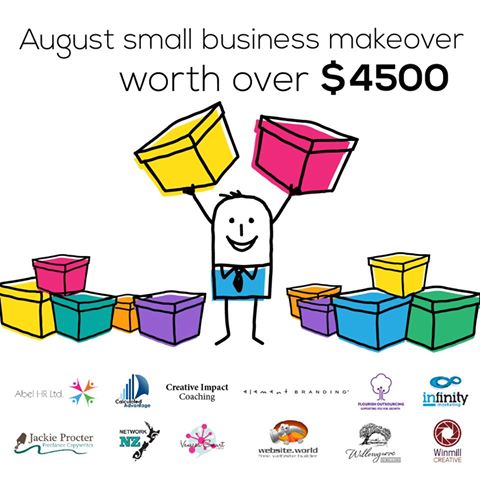
Promotion:
Last day - ends tomorow:
We've joined up with 11 other service providers to bring you this AMAZING GIVEAWAY worth $4500!!
Awesome Updates and New Features
- Directory Widget - Now has 5 categories per listing
- Photo Shopping Cart - you can now search for photos by keyword or private gallery code.
- Most 3 and 4 column thumbnail layouts have been upgraded to 320x320 sized thumbnails. Higher quality images do increase the download time and traffic, but look better on our new wider format templates
- New training videos

Professional Mobile Upgrade
Only $100+gst
Professional mobile upgrade service. (RRP: $299)
Need Professional Help For To Make Your Existing Website Mobile Responsive?
It's possible you may break some elements of your website if you attempt to change the template on a live website.
Our in house web designers are keen to help you update your old website to a modern new responsive look. Normally we would charge $250 for that sort of upgrade. If you go ahead before end of August, we will do your mobile upgrade for just $100+gst

100% Website Up Time
We have returned to our 100% up time winning streak, after the outage in June destroyed our year long march in the 100% zone. June was a low 99.85% up time due to that big Sydney storm.
Over the last 2 months we have performed many system upgrades to make our hosting service more robust and deal more gracefully with outages in specific geographical locations.
Uptime stats provided by Pingdom.com
Need one-on-one Website Builder Training?
If you require personalised training, please contact one of our consultants, who are based all over. Several consultants also provide over the phone and web based training at a scheduled time.
We would encourage all customers to get at least one hour of training at the early stages of building their website, and one more review prior to going live, just to give your website that professional critique, and quick tidy up of the rough bits.
Training topics include:
-
How to use website builder and shopping cart
-
How to design websites
-
How to crop and tidy up photos
-
How to optimise to get your website higher on google and other search engines
-
How to setup a facebook page, or other social media account
-
How to send newsletters
-
How to use any other feature we offer.
Clearing your Browser Cache and Publishing
Caching speeds up your computer, but it also causes confusion when viewing changes to your website. Every web master needs to become familiar with this concept. Almost a third of all our support tickets relate to mis understandings about caching. We can't change the nature of the internet, we only educate.
- Pressing publish button is neccesary even before you go live. Pressing the publish button allows you to navigate your trial website. When you navigate your trial website, you are actually navigating the published pages in many cases. Only the first page to preview in preview mode usually shows your recent changes.
- Your web browser is not aware that you are currently editing your website. The web browser does not undersstand any connection between our website builder CMS, and your website with a completely different URL. You typically need to press REFRESH on your browser to see recent updates. Or you may even need to clear your browser cache.
All New Training Videos
Andrew has been busy making some awesome new training videos, to show you just how easy it is to do some amazing things. If you want him to make more great videos, please email support telling him what a great job he's doing, and what you would like to know more about.

Better Broadband (NZ Customers)
We have teamed up with the awesome ISP's to offer you some great broadband options. If you have become disgruntled with your current isp, now is the time to get a great bundled broadband offering, including the following ISPs
- MyRepublic
- 2Talk
- BigPipe
https://www.websitebuilder.world/listing/nz-broadband-providers
0800 Numbers and Cheaper Tolls (NZ Customers)
Do you need an 0800 number for your business? We think 2talk provide a really awesome service, and it's who we use. For example, you have an 0800 number call your landline first, then your mobile, then your 2IC's mobile to ensure that somone will take the call. Their rates are cheap, and all the value added services can be managed via a web page control panel, so you don't need to wait on hold for any call centers. You can manage your lines fully yourself.
Receive a 25% discount off your web hosting, for life, by referring a friend
Did you know that if you refer a friend to use our awesome website builder service, you get a 25% discount off your hosting? If you refer 4 friends, then you will essentially get your web hosting for free! Not only that, but your friends will also get their 2nd month web hosting absolutely free. That's a nice little encouragement for them to check our service out and gives us the opportunity to setup your discount. Both discounts apply for your 2nd and subsequent websites also. It doesn't matter if it is yours, a friend, family or a stranger. Discounts begin once both websites are live. Please make sure you or your friend communicates the referral at the earliest opportunity.
Reseller Options
We have an awesome new offer for web designers and awesome business networkers. We can setup any web designer who is interested with all they need to get started as a web designer at no cost:
- There are no setup fees, no contracts to sign.
- You will earn $2+ on every domain name sold (based on RRP $19 per year).
- You will earn (25%-50%) commission on hosting
- You can manage all your customers content, domains, emails etc, easily from just 1 login.
- We take care of all the billing arrangements, so no administrative hassle.
Need Help! is at hand...
There are several places you can find answers to questions about how to build your website and add features (which, there are a lot of) and its free for you to look:
If you can't find the answer you need - then get you can Contact - Web Designers or lodge a Support ticket
Cool links
- http://www.wikihow.com/Clear-Your-Browser's-Cache - Clear your browser cache
-
http://word2cleanhtml.com - Cleans word docs for CMS Editor
-
GoogleFonts - Online Web Fonts
-
http://pinterest.com/ - A social networking Pin Board
-
http://pixlr.com/ - online photo editor
-
http://www.photoshop.com - online photo editor
-
http://www.jotform.com/ - online form builder
-
www.needanerd.co.nz - NZ Wide IT Nerds
-
www.geeksonwheels.co.nz - NZ Wide IT Geeks
-
https://www.pexels.com/ - Free Stock Photos
-
www.ninite.com - absolutely the best way to install new software on a new computer
-
www.2talk.co.nz - cheaper VOIP calling and 0800 incoming call routing
All those links and more at our new toolbox page:
Websites of the month
Here's a selection of some of our recent Go Lives.
- http://www.teamtees.org.nz
- http://www.epicdota.com
- http://www.thebedstore.co.nz/
- http://www.TrueWesternWear.nz
- http://www.myfastcash.co.nz
- http://www.nzspp.co.nz
- http://www.H2OBlastingChristchurch.co.nz
- http://www.codexedit.com
- http://www.maternitysupportandeducation.co.nz
- http://www.alphamews.co.nz
- http://www.gideonsnz.org
- http://www.lahmanenergy.co.nz
- http://www.poolcaretech.co.nz
- http://www.furnacc.com
- http://www.myersecology.kiwi
- http://www.veaimagesolutions.co.nz
- http://www.rcparts.co.nz
- http://www.donsdiscounttyres.co.nz
- http://www.rjsscaffoldhire.co.nz
- http://www.asiltd.co.nz
- http://www.karatefudokan.co.nz
- http://www.silversky.co.nz
- http://www.webworkx.co.nz
- http://www.summitlodge.co.nz
- http://www.letsgoparty.co.nz
- http://www.standingtrialpopulations.nz
- http://www.rainbowfish.co.nz
Please contact us for more information.
From the Team @ Web Widgets Ltd
Website World - Free Website Builder
Posted: Mon 15 Aug 2016